I read the New York Times email update most mornings. I learn a lot but I also shake my head a lot in disappointment. This morning incited the latter.
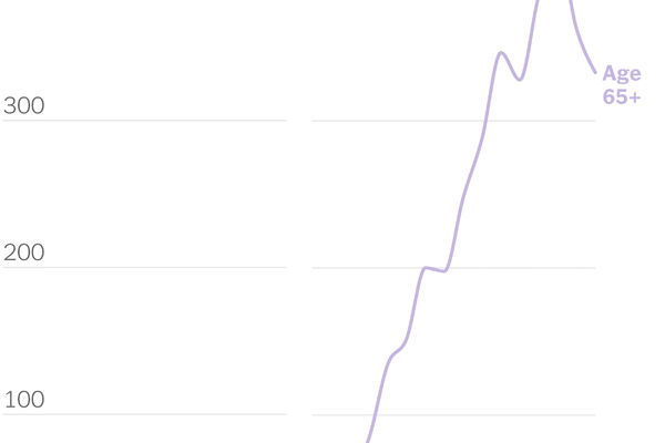
The NYT likes to use skinny charts for dramatic effect - shrink the width and the peaks look ominous. Case in point, the first image below that shows a peak of over 400 weekly hospitalization cases per 100,000 for Minnesota residents over 65 who not fully vaccinated.
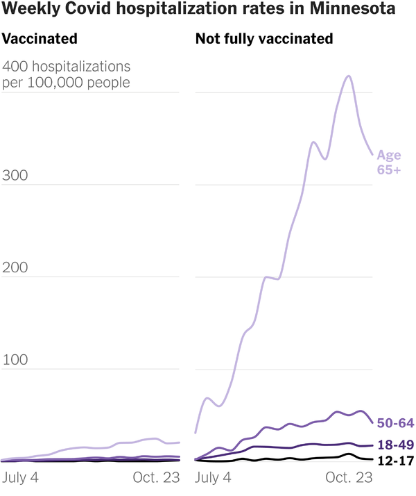
It shows the source as the Minnesota Dept of Health's Weekly Covid-19 Report. So, instead of working like I should be doing, I took the time to do some of my own research. The NYT used the data on page 37 of the report.
First of all, the report (below) does not show over 400 hospitalizations for the 65+ age group. It shows over 400 cases per 100,000 of that age group.
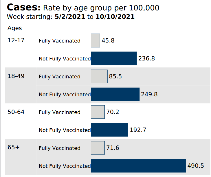
Hospitalizations are 125 per 100,000 for that age group (image below).
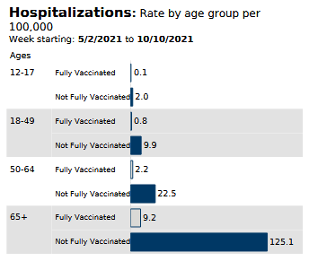
Add to this the fact that this is the cumulative rate over the course of 5 months. At least, that is my interpretation of it.
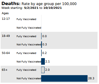
Below is the cumulative death rate over the course of that same 5 months. If you are unvaccinated and 65 or older, your chance of dying from COVID-19 is 0.0283%.
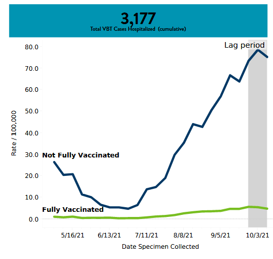
The overall Minnesota hospitalization rates, regardless of age group, seems like they peaked in early October (image below).
Now let's compare this to the CDC's Lab Confirmed Influenza Hospitalizations report for the 2017-2018 flu season (filtered for Minnesota, 2017-2018 year, and each major age group). The peak is for age 65+.
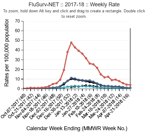
2017-2018 was a bad year for the flu and peaked near 50/100,000 for the 65+ age group. But 2016-2017 peaked near 40/100,000 for the 65+ age group. Covid-19 hospitalizations peaked just under 80 in early October.
One more chart from the Minnesota Dept of Health's Situation Update for COVID-19 (below). This shows total hospitalizations per week from March 2020 onward. Blue is general hospitalizations and green shows ICU hospitalizations. Remember flatten the curve around April/May of 2020? That was primarily geared toward ICU beds. It seems to me that has remained fairly flat, despite the rapid rise in infection rates and general hospitalizations.

You can easily derive that hospitalizations and overall infections are minimized for those fully vaccinated. Same with death rates. But what the data suggests to me is that vaccination status doesn't much matter for transimssability of the virus. Anyone can get it and anyone can pass it to others. That sort of overturns the argument that you're saving others by getting vaccinated when in reality, you're really just saving yourself. And to me, that makes getting the vaccine a personal decision just like the flu vaccine.
What the data also suggests to me is that hospitalization and death rates, in general, for this virus aren't all that different than hospitalization rates for influenza. Is this virus worse? Yes. Is it a Black Death level killer? No. Especially now.
We've had nearly two years to understand this virus and, although we still can't pinpoint how it spreads, we have learned to control it with vaccines, antiviral therapies, and other treatments.
Back to my original point. The New York Times, time and again, participates in delivering misleading, and often false, information to its readers. Just like the inaccurate chart at the beginning shows, they seem to want to incite panic and clicks, just like every other media outlet, wrecklessly trying to find profit in news that should be reported truthfully without spin.
How do we get past the need to drive clicks and engage angry, segmented readership and instead, deliver honest and accurate news? The world really needs a new model for news gathering and reporting.
